
Monthly Archives: December 2014
Moving image is the enemy

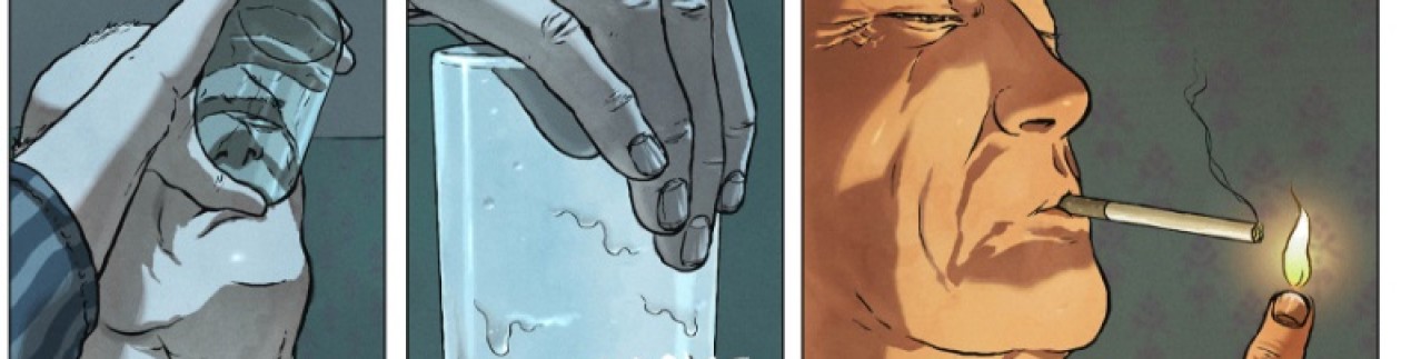
Today’s panel: Sam Pezzo by Giardino

PHAT FURY INTERVIEWS CHRIS GEARY
“Blériot” (vol.6), “The Ballad of Cuthbert & Kaye” (vol.9), “Kora” (vol.10 to 13): that’s a lot of varied contributions. What draws you to Aces Weekly?
Aces Weekly is essentially the perfect anthology, and perfect vehicle for storytelling. Most anthologies have a specific agenda/genre, sci-fi, horror, etc, but with Aces Weekly there are no limits. The only rule that David gives us is, “You have 21 pages, make it the best you can”. This leaves the creator in complete control.

Let’s start with “Blériot”. The dialogues are very short, many pages are wordless, and your drawings flirt with minimalism. How do you conceive the use of simplicity?
Given that comics is a visual medium, I try and see what I can do with as little text as possible. Weirdly enough I started along this line of thinking many years ago when my lettering was just something above awful. So to try and limit that awfulness, I decided to try and tell as much of the story through images. Then in terms of simplicity, I just found that I’d grown to prefer a more minimalistic art style over one that’s over-rendered. I’m a big fan of trying to get as much expression out of a line as I can without cluttering it up with needless details.
Does the event of France and Britain being linked by air for the first time hold special significance for you?
Sort of. One of the projects that I worked on before “Blériot” was International Aces, a series of graphic novels about the top pilots of the First World War, and it was Blériot’s success at crossing the Channel which led to his plane being used as a trainer during the war. A variation of the model he used features in the story of Francesca Baracca in Volume 2 of International Aces. On a slightly related note, ever since I heard of the Concorde, I was always intrigued that it came about due to a joint effort by British and French companies.
How much did you research for it? What can you tell us about the plane Blériot used on that occasion?
Once I decided to work on Blériot (a suggestion of my publishing partner on International Aces) and after I’d read any documents and collected any pictures I could find, I went to the memorial that has been set up near Dover Castle where he landed. Then I took the ferry over to France in order to take photos of the beach that he used to take off from. I also took pictures of both shorelines and the Channel as I travelled to and from Calais. As well as using what I could of the geography of the area, I used its colours for the basis of the palette I used on the strip.
As for the plane that was used, it was the Blériot Model XI. This wasn’t his most recent design, but at the time it was the more practical model to use. As it was the most successful of his planes flown at the time it made the most sense to use that as Blériot was quite certain how it would perform.
Is there anything you wish you could have included but decided not to for brevity’s sake?
I would’ve liked to show more of Bleriot’s life either side of this event, but I didn’t think that the format of seven weeks, three-page chapters would be the best way. It would’ve made it too episodic. I did consider having more pages of him in the air, but again, I wasn’t sure if that would have been the best way. As it was, I extended the last three chapters by a page so that I could tell the story the best way I could without compromising too much.
What does that period mean to you?
That period has been a constant in my life for almost as long as I can remember. More recently due to working on International Aces, but in junior school we studied the period 1904-1919. Also the first few artists whose work I first noticed came from around that period (Alphonse Mucha, Arthur Rackham, and E.H. Shepard).

“Cuthbert”: You really recreate the feeling of a ballad, don’t you?
I’d like to think so. I’ve been interested in iambic pentameter in quite some time, and I like the idea of using that format to tell a story. Also my favourite types of songs are those that tell a story (Hotel California, and Highway Chile, for example). It’s quite a tricky thing to do (at least for me) and it’s the second time I’ve used the format to tell a story, the first being “The Ballad of Otis P. Mattingly”. A story about a man who becomes immortal. I have another idea for a story that I may use the format for again in the future.

“Kora”: It seems to me you tried to recreate the feeling of old films and comics from the 30s and 40s, and you added the care of someone who’s mindful of design, balance, rhythm, and visual effects in general. Am I right?
I’d like to think so. One thing that happened as I got more and more into learning about comics, is that I became more interested in creators before the generation of those that I was reading on a regular basis. And this then continued further back, so now it’s artists like Alex Toth and Alex Raymond that I look to for inspiration should I need it. Although I don’t draw in a style similar to them, I feel that their approaches are similar to how I think and that’s why like them.
Specifically with “Kora”, as it is mostly silent I have to make sure that it’s readable without the use of text. This is where those elements you mentioned have to come to the fore as I don’t have the luxury of using text to explain what’s going on.
Is the title’s font turn of the century?
Yes. It’s an Art Nouveau style called “Sanctum Santorum” created by Comiccraft (best font designers in the World!!). Again, some influence of Alphonse Mucha coming through.
What are you trying to achieve with these predominantly silent pages? They go on for so long that one feels as removed from civilization as Kora herself. When she’s found again, the dialogues seem deafening and frantic, like a long mind trip has suddenly come to an end.
The main thought behind the silent pages was that at first Kora is alone, so no one to talk to, and although I have nothing against thought balloons, I wanted to see if I could show her character through action, and as she is on an alien planet and she can’t speak, or understand the local language. As I didn’t like the idea of having her trying to explain that she doesn’t understand them, I thought it would be better silent. Then another thought struck me, that it might be wise to keep quiet in that situation as you don’t know how our voices could be perceived by someone that doesn’t understand. The same goes for body language. Even between the different cultures on our planet certain gestures have different meanings, some are quite drastically different. So my thinking was, that if she decides to remain as neutral as possible she’ll be okay. Sometimes that works, and sometimes it doesn’t.
When it came to the little bit of dialogue that I included, it came at a point where there was someone she could talk to. Even then I considered dropping that as I think it reads okay without it, but as I wanted a few details to be included for later chapters, I thought it better to keep it in.
What’s the meaning of adventure in the 21st century, when we’ve seen every kind of adventure?
That’s a tricky one to answer, as what could be adventurous to one, could be an everyday occurrence to another. In terms of storytelling, there’s no knowing that what has come before has been seen by everyone. Straight away I can think of two other comic stories that start with someone lying on a beach. I have no idea which one of those came first, but both are completely different from each other, as Kora’s story is to both of them.
I suppose the best we can hope for is if there are similarities between a story we want to create and something that has come before, we can express it in a way that only we can. Tell stories that only we can, and not try to emulate someone else.
What do you have to say about the wide expanses of pure color that you use?
Not sure really. About the time that I became disinterested in creating over-rendered work, I became increasingly concerned with composition and shape. As long as I get those elements right, I then put in the bare minimum needed to tell the story. Not in a lazy way, but more in a way that allows the reader to see what’s going on without unnecessary clutter to get in the way. Especially with action sequences. Just the action should be shown. Ideally if the environment has been established beforehand, the reader will just go with the action, and hopefully you get a better reaction to the story.
The same goes for the colour. Without sounding like an old fuddy-duddy, I prefer the older style of colouring where they were limited by the printing methods at the time. Having to keep it simple actually served the medium. I know a lot of people have a simple line style, but then use a lot of detailing on the colour. That doesn’t really interest me, as I think that sort of defeats the object of having a simple, graphic, style.
How do you feel when a film’s impressed you, and you go back to the soundless, motionless little squares of your drawing board?
Pretty good. Although I love film, I love the idea of essentially being in complete control of telling a story through comics even more. If all goes to plan, then it’s only the creators that have any real input in the comic. With a film, there are so many people involved, that it’s really hard to say that it’s one person’s vision. I know that there are those that believe that to be true, the final result is a product of the hard work of a lot of people. To say that it is the vision of a single person is being more than a bit discourteous to everyone else. At least with comics, you can have as little as one person create the whole thing. If it works or doesn’t there isn’t anyone else to take credit (or blame).
What plans do you have for the future? Will you still contribute to Aces Weekly?
At the moment I’m working on a follow up to Commitment, the business graphic novel that I did last year, and I’m just about to start work on another project that I can’t say too much about at the moment.
I do have other ideas for Aces Weekly, some of them involving Kora, and I should get to them towards the middle of next year. Or if schedule permits, a bit sooner.working on a follow up to Commitment, the Business Graphic Novel that I did last year, and I’m just about to start work on another project that I can’t say too much about at the moment.
Today’s panel: Les Sextraordinaires aventures de Zizi et Peter Panpan by Lauzier
