Can you describe your drawing equipment in detail for us?
You’ve caught me right at the point when I’m switching to digital drawing! But up to now, all my comics have been drawn with the following: I usually work up thumbnails, character design sketches etc with any old pencil I have to hand, preferably somewhere around a 2B, drawing on normal cheap printer paper. I work up my tight pencils with a Caran d’Ache non-photo blue pencil or a .5mm blue lead (getting harder to find) technical pencil. I ink on Bristol board with a combination of unipin fineline pens, my trusty (getting old!) Pentel brush pen and these little Japanese wooden brushes which I found in an art shop several years ago, which are still going strong. I’m just switching over to drawing on a tablet, so watch this space…
What difficulties did you have to overcome to get to your present level? What did you find technically a challenge to represent?
I came back to drawing comics after a very long hiatus. I had to re-learn how to draw, and more specifically, how to draw ‘comics’! It’s not enough to just know how to represent an object, a character or an event – you’ve got to make it interesting, appealing, get it to ‘move’, make it compelling and to make the reader want to move through the pages. I just started drawing comics (they were awful) and kept going, taking advice and criticism wherever I could get it. Learning this stuff takes a lifetime I think, so I’ve plenty of learning to do and difficulties to overcome yet! Specifically, I still struggle a bit with anatomy and dynamism. I endlessly draw and re-draw characters until I’m (mostly) satisfied with them, although as with anything, the more I draw the quicker I get. I tend to be a bit overly precious about detail, but I’m always trying to get looser and care less about things a bit – being overly cautious when drawing stories can slow everything down and ‘anchor’ it too much.
In answer to the second part of the question, if you mean as regards ‘Deophonic’, some of the streetscapes were murder to get right, most particularly the iron bridge over the river. Lots of photo references needed! The surface of the river itself was a big challenge, trying to convey the choppiness of the water and get the icy wind into the readers’ bones.
 from ‘The Slaughterous Apprentice’ (2017), written by River Apparicio for ‘The Psychedelic Journal of General Wizardry’ anthology from The Psychedelic Journal
Let’s talk about ‘Deophonic’, then. How did the collaboration with Martin Hayes come about?
Martin contacted me initially on Twitter having seen some of my posted drawings, and asked me if I’d be interested in doing a comic with him. I looked at some of his previous work on his website, and he had just completed another story in Aces, ‘Older than the Hills’ drawn by Chris Askham and lettered by Bram Meehan. I really liked it and it became obvious very quickly from talking to Martin that he and I share a lot of the same interests when it comes to books, films and comics. Once he told me the initial premise of the story (spoiler alert) – an elderly guy who starts hearing god talking to him through a radio – I was hooked. He was more than happy to let me have a lot of creative input into the comic and was, from the start, very collaborative in his approach. I was delighted as a relative newbie to comics to have an opportunity to work with Martin. He writes a great comic, that lad! He introduced me to Bram online and it went from there.
What’s your vision of a great story to illustrate?
That’s a tough one to answer. I’ll draw anything as long as it’s a good story! Something I dream of drawing though would be a big, sprawling epic, somewhere halfway between realism and fantasy/ horror. The type of comic where an artist gets to really let go and plumb the depths of their creativity. I love comics rooted in reality too, but I think as an artist I would prefer to be able throw in the odd monster here and there! I suppose it all comes down to influences, really. My main ones growing up were in science fiction, fantasy and horror comics – 2000AD, Sandman, etc. , and I still seek out that type of thing today. They’re the type of stories I like to read, so they’re the type I like to draw too.
Don’t you think following one’s influences too directly leads to repetition?
Yes, it can undoubtedly, but I imagine that’s down to the individual. There has to be a distinction between trying to emulate someone or something and trying to ‘learn’ from someone or something. Naturally if your goal is to draw just like a particular artist, or only work in a very singular area, then yes, it would be hard not to repeat yourself! But learning from others is part of how we develop our talents. If I listed all the artists and comics which have influenced me over the years I’d be writing for a long time. And that doesn’t even include influences from books, films, music etc. I know I draw the way I do because of the things I’ve picked up along the way. Following your influences can get you to a place where you’re more confident to expand beyond your comfort zone, take risks and hopefully grow better as an artist.
There’s obviously a love of detail and texture in your art. Who had the idea of the title page in ‘Deophonic’ revealing part of the first page through the letters? Turning the page feels like lifting a curtain or a veil. It’s quite spectacular and an excellent use of the digital support.
I’m fairly positive that the idea for this ‘peek’ title page came from Bram (Meehan), but it may have been Martin (Hayes). I think it works really well. From the outset Martin wanted the interior shot of the radio as the opening image, and talked about how it might reflect or suggest the innards of a human, which I thought was a brilliant idea. There’s something quite alien and organic about the old valves and connectors in these sets relative to our modern electronic innards. I had researched lots of old radio sets and their workings so with the help of plundering copious photo references this image came about. As you point out, I love detail and texture so this image was perfect for that, something to really go to town on. With Bram’s title page I love that’s it’s not immediately clear what the stuff is behind the letters, and that that organic feel of the workings is present. I like your analogy of lifting a curtain – kind of makes me think of the opening of a play, or one of those old horror movies where the wizened old shopkeeper pulls aside the curtain to bring the unwitting customer into the back of the darkened shop… The title page also worked as a publicity shot as you can see that there’s something going on behind the lettering which may have piqued the interest of potential readers.
I was about to ask you about the radios and electronic equipment. Do they reflect a personal interest of yours, or did you just follow the script? Can you present us these devices and the era they come from?
Not a particular personal interest, no, apart from a mild passing interest as an artist in cool old objects. I did research as I always do when presented with a project like this, and found a lot of information on these wonderful old devices. Prior to that, Martin did a lot of research upfront and provided me with a huge amount of images of radios, junk-filled workshops, everything that he wanted to recreate for Bill’s world. He also chose Bill’s radio itself and provided me with initial images and descriptions. It’s a Bush dac90a radio, which dates from the 1950s I believe. When I first saw it, I thought it was perfect. The dark Bakelite case had a great texture to it, there’s an organic ‘soft roundness’ to the shell, and I loved how simple and compact it was. I thought it was a good representation of the past, something that this story has at its core – how we disregard and throw away things of value, including people. I also felt it was a bit ‘un-definite’ in its form if you know what I mean. While it dates from the 50’s, its styling might easily be confused with something much earlier, and I liked that oddness.
The other equipment is basically based on a random selection of old devices provided by Martin or which I came across myself, dating from different eras from around the 30’s to the 80’s (-ish), most of which I changed in some small way for ease of drawing or because I just preferred them that way (though at the start of the project I slavishly recreated actual radios because I didn’t at that stage feel confident enough to come up with them myself). They all are old though – there’s no new technology in Bill’s world apart from his mobile phone and Ebay.
I’d like to sound clever and say I understand the title but I don’t. Does it mean the ability to hear God? I guess this question would better be addressed to Martin Hayes.
Yes I think so! He’s definitely the man to ask. However I know ‘phonic’ comes from the Greek for voice, and nowadays we associate it more with artificial or boosted sound – telephone, microphone, megaphone etc. and deo or deus is god in Latin. As I said earlier I was already hooked on Martin’s idea, that of a man being able (or thinking he’s able?) to talk to god through a device. When Martin told me the name of the comic I thought it was perfect, really evocative. I’ve always thought of it meaning ‘god-sound’ or ‘god-voice’ – but through hi-fi!
What part did your training and practice in architecture play in the creation of the story? Do you still enjoy representing buildings? (looking at the result I’d say you do)
I am very interested in the built environment, and how cities grow and shape the people who live in them. And yes, I do still enjoy drawing buildings. I’m not sure that a background in architecture necessarily makes you a better artist of buildings though. If anything, it might be a bit of a hindrance rather than a help – I can be a bit obsessive about detail and I slaved over those drawings of the buildings for a long time. I’m sure that comes from my work background. I knew these buildings were important to the story, as Martin had very specific locations in mind. He provided photos of the locations he wanted and I felt it was important to represent these faithfully so as to get Martin’s ideas across fully.
For example, page 12 represents the Famine sculpture on the quays of the Liffey by Rowan Gillespie, dedicated to those victims of the famine who were forced to emigrate, juxtaposed with the looming towers of a major bank headquarters beyond. I’ll leave you to draw your own conclusions about what Martin was trying to say here! I had previously noticed when they were first built that these towers, when viewed from a certain angle, form a vaguely ominous pyramidal shape (cue Twilight Zone music), and we were able to use this in the image. Martin also wanted the inclusion of ‘The Poverty Stone’ (a commemorative stone marking the United Nations International Day for the Eradication of World Poverty), and Liberty Hall, which is the headquarters of a major Irish workers’ union. What you see in the comic is more or less a faithful reproduction of what’s on the ground in this area of Dublin, which I suppose is where my experience may have come in handy.
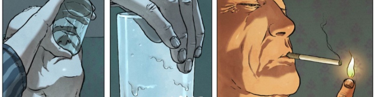
 from a recent science-fiction comic
How would you characterise your drawing style? What do you have to say about the kind of graphic texture you look for? Are you interested in variety when it comes to style?
I’m not sure, really – realistic? I’d prefer to think of it as evolving! Hopefully getting better. I think my art is still a bit stiff and I am always trying to loosen it up a bit. I do wish I had a more distinctive style. I look and marvel at artists like Tiernan Trevallion, James Harren and of course Mike Mignola (I could go on and on), all instantly recognisable and wonderful. Long ago I used to draw with more of a lean into the cartoonish side of things, kind of Jamie Hewlett-ish (but not as good!) and I may head back that way once I’ve gotten to a better level of confidence with anatomy and storytelling.
I’m always trying to learn as regards texture. I like things to look real, but there’s a danger there of going too far, ladling on texture too much, and weighing down the image. I struggle too with certain materials, fabric in general, reflective things etc. I’m always looking at how others represent these things.
As regards variety, well as I’ve said above, I hope I’m evolving style-wise, so yes. I have no interest in drawing the same way for ever. I want to get better and that will necessitate and encourage change. Some artists seem able to vary their style according to a story, and to do so in a consistent manner throughout. I’m nowhere near there yet, but would like to be.
Can you tell us about your other comics (past, present and future)? Where can we find more by you?
I started doing comics again about three or four years ago and got involved in small press. My first published comic ‘The lady of the Lee’ was in a local small press anthology, ‘The Cork Horror Comic’ and from there I began to meet other comics people and tried to get my stuff out there. Following on from ‘Deophonic’ with Martin & Bram I did several small press comics including ‘Sky Burial’, a horror story written by Alec Robertson, and ‘The Last Wizard’, a comedy/ fantasy by Matt Sharp, for Futurequake Press, which appeared in their ‘Something Wicked and Futurquake’ anthologies. I also did another horror comic called ‘The Slaughterous Apprentice’ by River Apparicio for ‘The Psychedelic Journal of General Wizardry’ anthology from The Psychedelic Journal. My first long book came out in 2017, it’s called ‘The Broker’, and is written by Wayne Talbot and published by Rogue Comics here in Ireland. It’s a thriller/ conspiracy/ war/ action story, and we’re gearing up to do the sequel this year. I’m currently working on a couple of other things, including another thriller-type caper, written by Richard Gaynor about an assassin who employs quite unorthodox methods in his work.
I got some really great news late last year, which has resulted in me having just handed in my first completed strip to a large British publisher for publication in the coming months. I don’t want to say too much (ridiculous jinx-fear or something), let’s just say it’s the culmination of a lifelong dream, relentless optimism and lots of long nights and I’m bloody delighted.
As for the future, who knows? Hopefully I’ll keep getting the scripts so I can keep drawing! I have a few other things in the pipeline alright. As well as ongoing work I have a few things of my own I’d like to get to eventually… I wrote a sprawling science fiction epic several years ago which I’d like to get off the ground one of these days in comic form. Long ago Martin Hayes and myself discussed doing a great idea he had which I can’t talk about. Even though he first mooted the idea a couple of years ago I still think about getting to it one of these days. Really I just hope I’ll be able to keep doing this comics lark for a while.
‘Deophonic’ is available in Aces Weekly volume 22.
Thanks for the kind words, both of you — I’ve always been really happy with that title page. I worked with Martin to get the effect of a fade-in, kind of like an old Play for Today TV show, but one that made full use of the Aces Weekly format.